infinix x yugatech

ZTE Debuts a new logo, business strategy for 2015

Listen to article

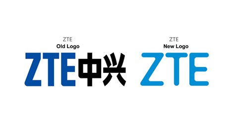
Chinese ICT company ZTE sure wants to end 2014 with a bang as it unveiled a redesigned logo and a new business philosophy, days ahead of its CES Press Conference on January 5.

zte-new-logo

The new logo has removed the Chinese characters and now features a lighter hue of blue color, and a more rounded, sleeker, and streamlined typography. In addition to this, the company also unveiled its Cool-Green-Open philosophy and the M-ICT strategy, which aims to open up its market presence by driving dynamic, youthful and compelling, sustainable and environmentally responsible, as well as open-minded and collaborative ideas and technologies into delivering higher value to customers, further driving the growth of our business. ZTE will also adopt a new slogan, “Tomorrow never waits”, reflecting the company’s ongoing commitment to providing customers with access to technology solutions that will define the future

For comparison, here’s a look at the old and new logos, side by side:

ZTE Graphic

How are you guys finding the new logo?

Source | Via 1, 2

React to this article:
Written by
Carl Lamiel

Carl Lamiel

Writer

Get in touch with Carl at @lamielcarl on Twitter or visit his website for more updates!

View all posts by Carl Lamiel →

14 Comments

MA
MarcelaEst · 11 years ago

I will right away clutch your rss as I can’t find your email subscription hyperlink or e-newsletter service. Do you’ve any? Please let me realize so that I may just subscribe. Thanks.

Reply
AN
Anony Mouse · 11 years ago

Parang yung ginawang kalokohan lang ng Yahoo dati na logo change — much ado about absolutely nothing. A change in logo won’t wash away the stink & blemish in this company’s image brought about by their catastrophically inept mishandling of their sales events.

Reply
A
a · 11 years ago

don’t care moving on

Reply
IG
igniculus · 11 years ago

it looks more cooler, modern and minimalist, way better than the old logo which looks like an outdated 90’s company :p

Reply
GA
gadgeteer · 11 years ago

new log doesnt really matter, same company image pa rin ang tingin ko because sa panloloko nila. hindi ko tuloy nabili yung katulong namin ng pang regalo ko sa pasko, hence I will never ever buy zte

Reply
EA
Easy E · 11 years ago

panget pa rin. Grabe pinagisipan naman yan masyado.

Reply
ER
eric jay · 11 years ago

haha.
at parang mas ok pa yung old logo sans the chinese character. and,
“Tomorrow never waits” — kaya kung may promo ulit, mas maiging pumila nang maaga.lol

Leave a Reply

Loading next article...