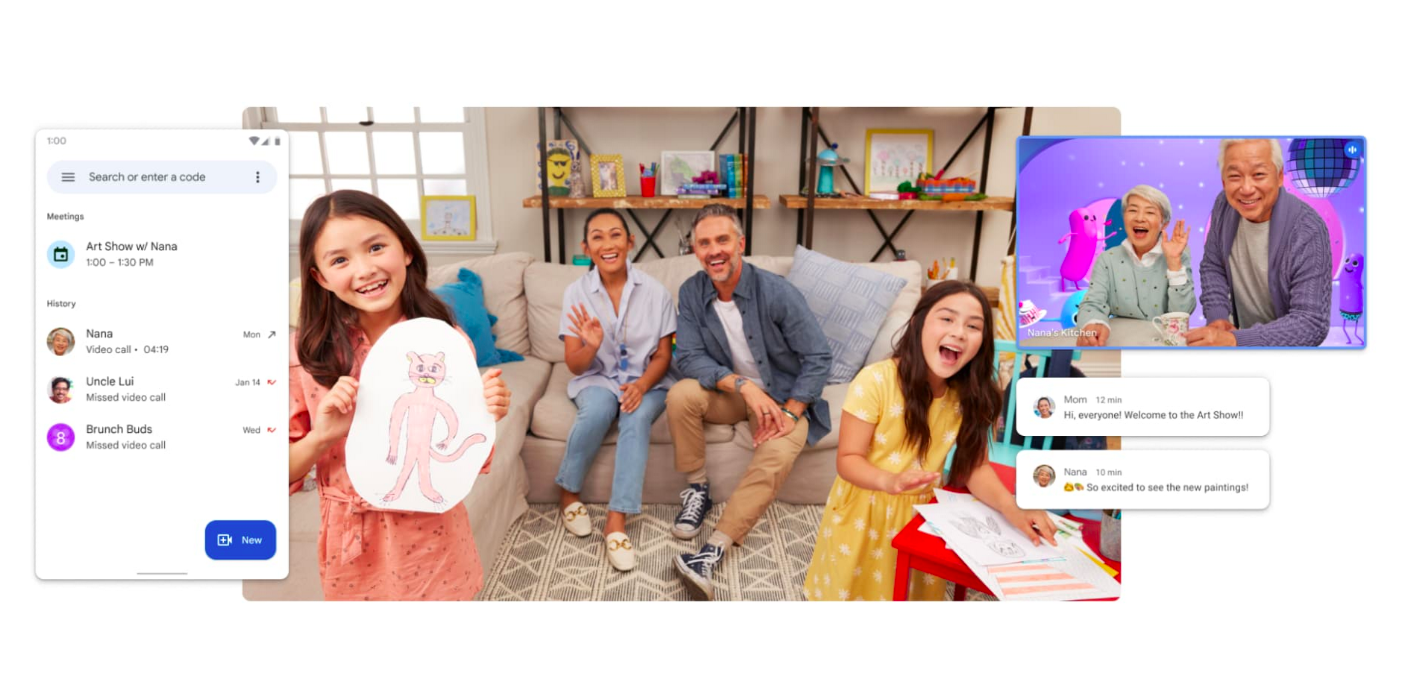
Google has silently made a minor update to its ‘G’ logo for the first time in nearly after a decade. While the color scheme remains the same, the company gave it a smoother, gradient-like appearance. In contrast, the current logo, which was introduced in 2015 when Google updated the Google font to a sans-serif typeface, had solid lines separating the colors in the “G” logo. Meanwhile, the full “Google” logo remains unchanged, and the company doesn’t appear to update it. As for other Google products, it remains unclear whether they’d get the same treatment. Presumably, four-colored logos such as Google Maps and Gmail could get the same gradient-like appearance. Google has two video calling apps, Meet and Duo, both serving different purposes. Meet was intended for school and business work in the likes of Zoom, whereas Duo had been designed for casual video calls like on Facebook Messenger or Apple's Facetime. Read more in our articles including "Google updates ‘G’ logo, now with gradient-like design" and "Google's Meet and Duo to merge in 1 app".
Google has silently made a minor update to its ‘G’ logo for the first time…
May 13, 2025
Google has two video calling apps, Meet and Duo, both serving different purposes. Meet was…
Jun 2, 2022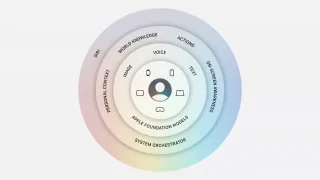
Apple did not build its new AI alone. At WWDC 2026, the company confirmed it…
Jun 9, 2026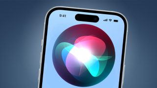
Back in March, we heard reports that Apple was looking to let the next generation…
Jun 5, 2026
Microsoft quietly released its AI writing and productivity assistant, Copilot, to both Android and iOS.…
Dec 31, 2023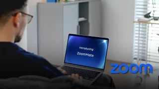
Zoom has introduced ZoomMate, a new AI-powered work platform designed to help teams turn conversations…
Jun 20, 2026Google has silently made a minor update to its ‘G’ logo for the first time in nearly after a decade. While the color scheme remains the same, the company gave it a smoother, gradient-like appearance.
In contrast, the current logo, which was introduced in 2015 when Google updated the Google font to a sans-serif typeface, had solid lines separating the colors in the “G” logo. Meanwhile, the full “Google” logo remains unchanged, and the company doesn’t appear to update it. As for other Google products, it remains unclear whether they’d get the same treatment.
Our coverage of Google App includes: "Google updates ‘G’ logo, now with gradient-like design"; "Google's Meet and Duo to merge in 1 app"; "Apple Built Its New AI Foundation Models With Google". Each article provides unique insights and information.