infinix x yugatech

PLDT-Smart unveils new brand logos

Listen to article

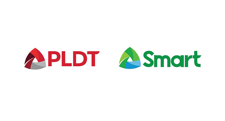
PLDT-Smart  has just revealed its new brand logos in their “It’s a New Day for PLDT-Smart” event. Manny Pangilinan, the Chairman, CEO and President of PLDT and Smart said that the unveiling of their refreshed logos are just a simple matter and it has been a long time since the old logo was created and designed by Tony Samson.

newpldtsmart

I hope you would like the new logos we’re launching tonight – Chairman, CEO and President, PLDT, Smart

React to this article:
Written by
Heland Ortega

Heland Ortega

Writer

This article was written by Heland Ortega, Junior Contributor of YugaTech. He is a graduate of Information Technology and Multimedia Arts at FEU Institute of Technology in where he is also now working as a full-time faculty. You can follow him at @helandortega.

View all posts by Heland Ortega →

56 Comments

DW
Dwyt · 10 years ago

Why do i think that the new logos of pldt and smart have illuminati roots… both are re in pyramid shape with a center that resembles an all-seeing eye. this is the illuminati symbol. not all seeing eyes have to be circular in form inside a pyramid. It can also be subliminally hidden from the naked eye. Not all pyramid shapes have to be a perfect pyramid. new discovery: the lines or strands extending from the center pyramid are a total of six. What a coincidence haha. three succeeding logos should say 666… Who told the artist to conceptualize some thing like that… 4give my grammar…

Reply
CH
chifou · 10 years ago

mukhang tangke ng gasul

Reply
A
a b c · 10 years ago

search digital triangle creative. 99% MATCH.

Reply
CH
chifou · 10 years ago

oo nga!!

WO
Wow! · 10 years ago

It’s like a drain symbol for toilets/sinks. News flush!

Reply
LA
lala · 10 years ago
Reply
PL
PLDC+SmarTurtle · 10 years ago

ILLUMINATI CONFIRMED!

Reply
BI
Bibbo · 10 years ago

“Its three sides represent the three things we value most: our Customers, our People, and our Technology.”

Yung customer yung bottom leg ng triangle?

Reply
SU
Sus · 10 years ago

New Logo Same OLD Shi*t

Reply
JA
Jaytones · 10 years ago

they have joined illuminati !!!

Reply
ST
Stefano Paolo Bunag · 10 years ago

The old logo of PLDT was designed by design systemat during the time of don ramon cojuangco. the color was changed to the red when, if I’m not mistaken, MVP’s group came in. They asked a foreign design studio to change it totally but only did minor changes on the actual look of the logo and the change to the red color.

Reply
ST
Stefano Paolo Bunag · 10 years ago
KA
kabebegirl · 10 years ago

Para ring logo ng mga product na pamatay peste like katol. hehehe. Ang pangit. Buti pa si Daniel Morial, pogi.

Reply
EZ
Ezra John Gubatanga · 10 years ago

The design is too generic.

Reply
KA
kabebegirl · 10 years ago

Hindi maganda. parang downgrade na ewan. Parang logo ng insurance company o mga plan plan ganyan.

Reply
NO
NotASheep · 10 years ago

Are they trying to associate themselves as “Google Drive” to gain Google’s popularity???? HELL NO! *flags the company to google*

Reply
BA
bakugan · 10 years ago

dapat snail and turtle logo :)

Reply
AR
Archie · 10 years ago

Bravo! Angganda! Parang yung mga nakikita ko sa shutterstock na hindi pinag-isipan at walang deep inspiration sa pagbuo. Very 2000 design lolz.

Reply
SD
sdasdadf · 10 years ago

smart pldt bagal internet hahaha

Reply
EA
Easy E · 10 years ago

Parang nagbebenta ng fertilizer ang Smart LOL!

Reply
AD
adam · 10 years ago

Triangle = Loading because of its slow network services :)

Reply
WT
wtf · 10 years ago

bagong logo, dating pangit na serbisyo….

Reply
LI
liam · 10 years ago

the logo seems like the verse position of logo of LBC hah……………..

Reply
A
a · 10 years ago

Google Drive????

Reply
BN
Bni · 10 years ago

Spot on! Does look like Google Drive.

BA
BabyP · 10 years ago

They might changed to a new logo, but they still have the same old crappy internet service. How about doing some “changes” first in your quality of service and very steep internet pricing before making some graphics changes?

Reply
AR
Archie · 10 years ago

Kaya nga sila nag-effort na magpagawa ng cheap 2 dollar logo design. Binabagay lang nila ang branding sa serbisyo nila.

JE
jenie · 10 years ago

Logo is a bit ho-hum. typography for PLDT looks good, Smart? meh.

Reply

Leave a Reply

Loading next article...