infinix x yugatech

This is how iOS 7 may look like

Listen to article

While Android may be facing just an incremental update in the next Google IO, Apple may be cooking up a major update to iOS. We posted a couple of reports for iOS 7 already, but we still have no idea how these details will be look like on the new OS.

iOS7 2

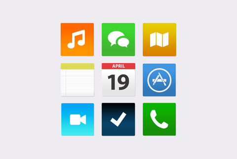
The reports called for a flatter iOS, with improvements in multitasking and in bringing information. It’s a little hard to imagine all of that on Apple’s platform – but SimplyZesty seemed to have figured it out, and we like every bit of it.

iOS7

They have managed to replace those popping iOS icons with a flatter look without having to look like a Windows’ Modern UI. They also introduced new app designs for the calendar and such. Camera, Siri & other apps looked more cleaner with the lighter elements that replaced the darker ones found in the present iOS.

Changes to the lockscreen are also made, and the designer also thought about a pull-down widget center. You can watch their video to fully appreciate it.

We’re hoping Apple’s software team takes note of this and does something better. Commenters everywhere were stating that the whole iOS 7 concept was like an offspring of Android & Windows Phone; would you agree with that? And is that a good thing?

WWDC 2013 will be coming next month, June 10-14, so stay tuned for more coverage.

{source}

Written by
Bob Freking

Bob Freking

Writer

Bob Freking occasionally contributes articles to the website. He is a UST Graduate of Commerce & Business Administration, Major in Marketing Management, and a full-time Sith Lord with three dragons.

View all posts by Bob Freking →

52 Comments

KE
Kent Ryan · 13 years ago

looks like Apple experiencing some update problems right now.. Right?

Reply
IY
Iya · 13 years ago

Oh no! Please, huwag naman sana ganito.

Reply
ZA
zarne · 13 years ago

‘The reports called for a flatter iOS, with improvements in multitasking’

LOL, Apple I0s don’t do multitasking so I guess it will be an improvement to add multitasking. Although it is a boring OS, it is simple to use,
stable, not core hungry, and because it is a closed platform , it’s more secure than androids.

Reply
PX
pxlcrnch · 13 years ago

i doubt this one, they might stick with rounded icons and stuff but less glossy and more premium like osx mountain lion icons.

Reply
AN
Anon · 13 years ago

looks like the Tile Launcher for Android..

Reply
PR
proud apple fan boy · 13 years ago

hoy mga ulol .. di panaman yan final..!
kung maka panget, dissapointed. copying android kayo jan ahh…! XD

Reply
EE
eewww · 13 years ago

Well, I guess Google(Android) and Windows should make a move. This is like a combined UI of the two OS. Sp who’s a copycat now?

Reply
FI
FinnTheHuman · 13 years ago

This is misleading, its nothing but a concept.

Reply
HD
HDD · 13 years ago

try this, you can get paid apps on apps store for free… https://featurepoints.com/r/QQE7S2

Reply
MI
mister · 13 years ago

hala! parang windows na pangit! kailangan yatang itaas pa ng apple ang presyo nila para maniwala ang mga tao.

Reply
PR
Prof. Santos · 13 years ago

Disappointed.

Reply
SS
SSD · 13 years ago

nothing extra-ordinary.they should also revamp internal features of the iphone/ipad aside from relying from its os. i’m sure they’re finding ways to beat sgs4/snote2 in this development. i’ll go for sgs4 if its under ios and not made of plastic…my iphone5 gets boring except to the apps and games i got that are not avail thru android..

Reply
GR
Greg · 13 years ago

Nice. I can’t wait to see all those apple isheep and fanboys who’d commit suicide because their “beloved” Iphone looks like android and windows phones when IOS 7 comes out.

Reply
AB
abuzalzal · 13 years ago

I wonder just how on earth are they gonna improve their stale ios without copying Android?

Reply
RO
ronjiedotcom · 13 years ago

Naniniwala na lang kayo sa kahit anong tsismis sa internet? Ang tatalino niyo naman!

Reply
RO
ronjiedotcom · 13 years ago

Not to mention, si Bob Freking ang nagsulat nito. Mga bagito ba kayo dito sa YugaTech (i.e. hindi niyo pa kilala ang panunulat ni Bob) o… mga Bob —-ing fans lang kayo? hahaha

AN
Anonymouse · 13 years ago

We’ve got a Smarty Pants Over here. -_- Flipping smarty pants replying to his own post. sheeesh.

JU
Justin · 13 years ago

Looks like a bad case of Android envy.

Reply
PE
pendulum · 13 years ago

It’s obvious that Apple is running out of ideas ever since Steve Jobs died. How disappointing, Apple.

Reply
FE
FemmeFatale · 13 years ago

But…. but…. It’s UGLY!!!

Reply
YU
Yusuf · 13 years ago

Omg. All hail Jony Ive.

Reply
RA
Rabitto29 · 13 years ago

looks good.. but.. it looks like android and windows phone 8 had sex

Reply
IA
Ian · 13 years ago

bwahahaha

FU
furion · 13 years ago

Nothing more than a blatant rip of Android.

Reply
YU
yum · 13 years ago

Looks plain and boring. The flat ui, at first, looks promising but when almost all manufacturers out there, devs, adapted this flat ui, it looks all the same to me.

It’d be a lot better to stay with ios6 ui design.

Well, not bashing apple but stick with your own :)

Reply
RE
red · 13 years ago

if this is the case for i07, i urged to revive the symbian os of nokia.. the king of multi-tasking!

Reply

Leave a Reply

Loading next article...