
Out with the old, in with the new. That is what Globe Telecom is doing now as they usher in a new and modern look for their website and company logo.
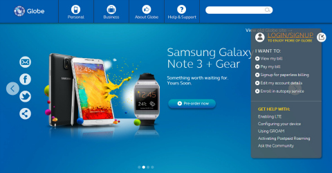
The first thing you'll notice when you visit the new Globe webpage is the use of a richer shade of blue, which is also evident with their new glossy logo, and a set of clean looking finger-friendly icons. The slider page is still there but is now slightly larger and placed at the center.
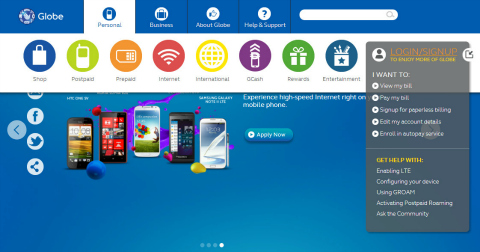
ウェブサイト上部に配置されたアイコンにマウスを合わせると、MeeGo を思わせるカラフルなアイコンの別の行が表示されます。スクロールダウンすると、Windows Phone 8 デバイスで快適に感じられるカラーパレットが見られます。
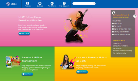
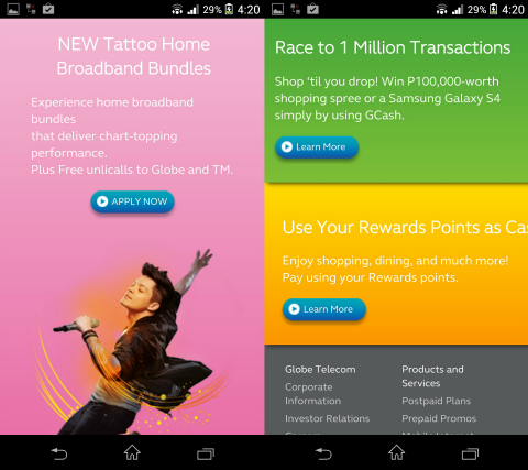
As you've noticed, Globe's new website took inspiration from mobile UIs. Well that's because it's now optimized to play well on your smartphone's mobile web browser which in turn reduces the need to inconveniently zoom in and out.

Globe Telecomの新しいウェブサイトは、URL「beta.globe.com.ph」に示されている通り、まだベータ版です。古いGlobeのサイトはまだ機能していますが、私はそれを恋しく思うことはないと確信しています。






Announced na sa beta site ng globe yung plan for Note 3:
http://beta.globe.com.ph/galaxy-note3