
Mapbox is a mapping software that shows people who tweet using an iPhone come from the rich neighborhood, while people using Android came from the less fortunate spots in America.

The photo above shows Newark, New Jersey with lots of green dots that represent tweets coming from Android devices. Now, I haven’t been there but according to the source Newark is where the less fortunate people live. In contrast, New York where lots of yuppies and business professionals dwell are flooded with red dots, representing tweets from iPhones.
“The rich, it seems, use iPhones while the poor tweet from Androids,” remarked Business Insider.
While that may be the sad case in America, it’s a bit different here in the Philippines. Using Mapbox, you can type in a specific city and country for it to show the stats. The pictures below show the Android and iPhone users in Makati, Manila. As you can see, the dots representing both parties are somewhat even.
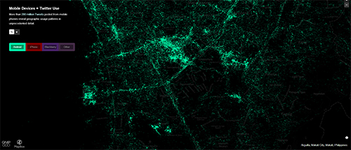

This just means that the users here in the Philippines are both fans of iPhones and Androids almost equally. You can even try it out for yourself and see the stats in any place of the world — there’s even a filter for BlackBerry and other users so it’s pretty cool to check it out.
{Source}


alam niyo asa user pa rin yan eeh
kung android or apple user ka nga pero hindi mo naman nagagamit lahat ng features wala din..
pero kung ako papipiliin android pa din ako kahit anong mangyari kahit hindi smooth mas madami kayang gawin ..
para saakin lang binabayaran ng apple user yung logo lang napansin ko sa apple user iniingatan yung logo ng apple pati case may butas para malaman ng lahat na apple ang gamit nila hahaha