
Google Maps introduced a new tool that shows critical information about affected areas with COVID-19 cases.

The update adds the Covid-19 information layer located on the top right-hand corner on Google Maps. It gives information about a seven-day average of new COVID cases per 100,000 people on the location you’re looking at. It also provides a label indicating whether the cases are going up or down. The density of new cases in an area could also be easily distinguished through a color-coding. Trending case data is visible at the country level for all 220 countries and territories that Google Maps supports, including the state or province, county, and city-level data available.

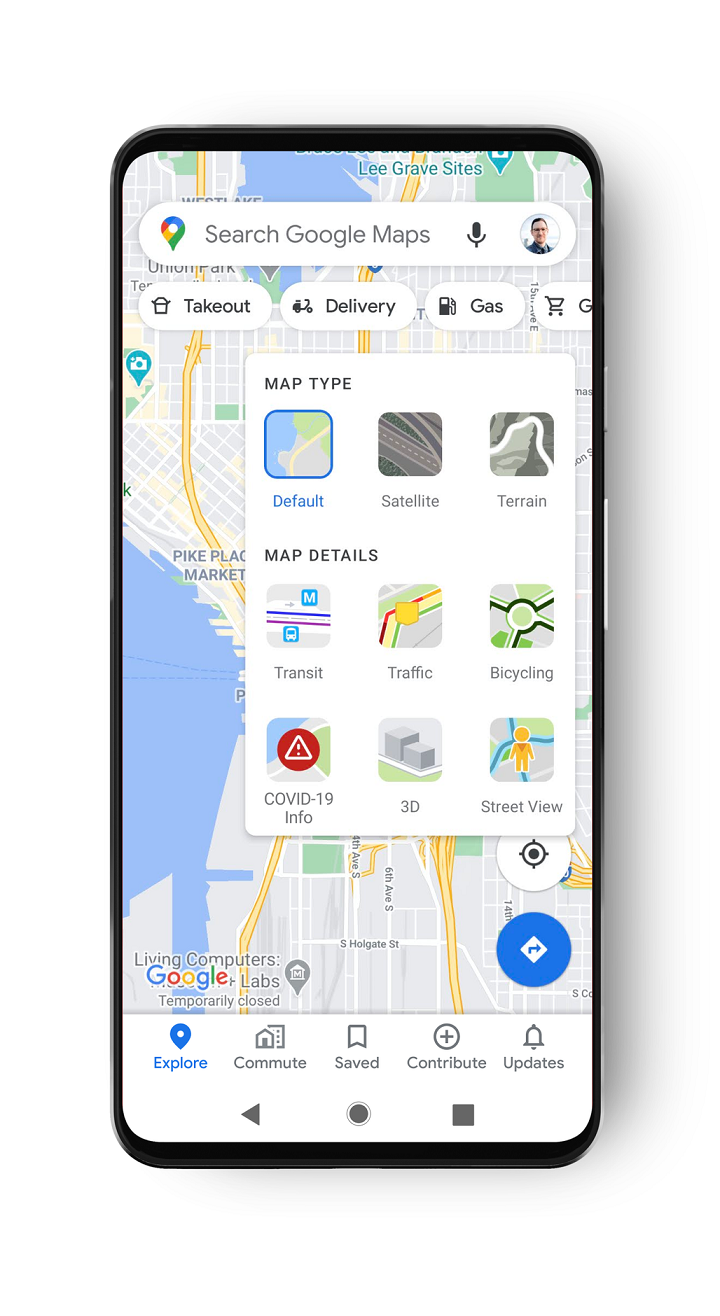

The information provided in the COVID layer comes from multiple sources such as Johns Hopkins, the New York Times, and Wikipedia. Data gathered are from public health organizations like the World Health Organization, government health ministries, including state and local health agencies and hospitals. Many of these sources already power COVID case information in Search, and it is now expanding data to Google Maps.
The COVID layer update is set to roll out globally on Android and iOS this week.
Source: Google


0 Comments
Leave a Reply